 Jobboy
Introduction: Why Data Visuals Matter in 2026 Resumes
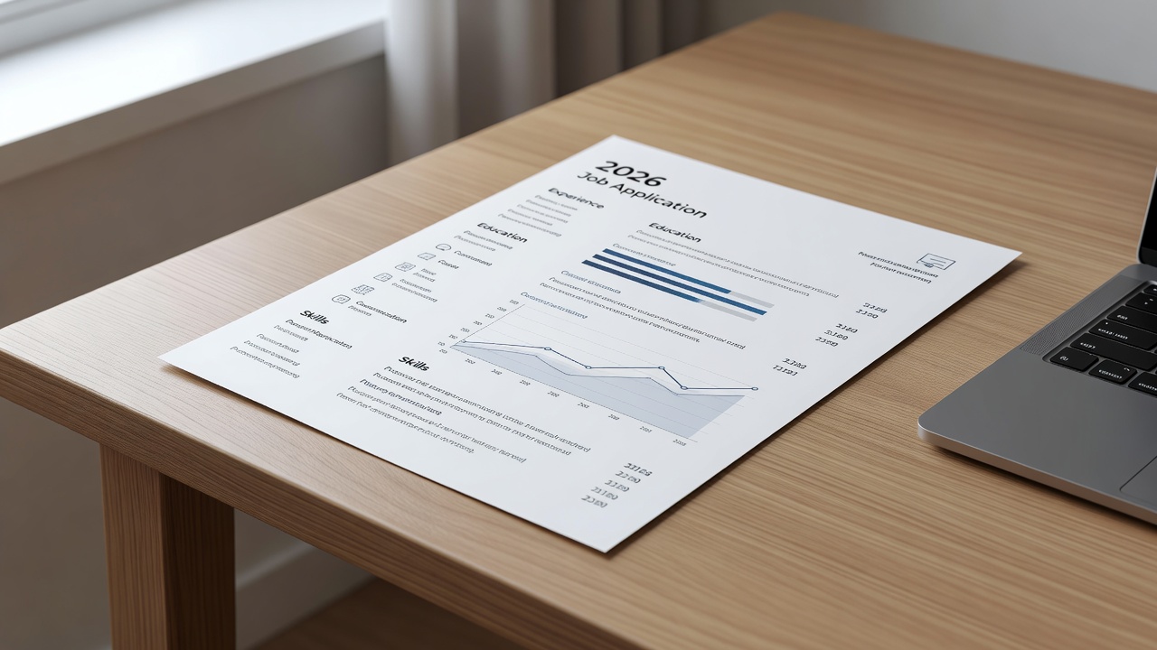
Job seekers in 2026 face a dual challenge: standing out to human recruiters while satisfying applicant tracking systems (ATS). Data visuals like charts, icons, and infographics can boost engagement when used strategically. This guide covers modern design trends, recommended tools, formatting steps, real examples, and common mistakes to avoid. Search intent around this topic focuses on balancing visual appeal with scannability, especially as hiring processes evolve with AI screening tools. Employers increasingly value quick comprehension of achievements, yet many resumes fail due to incompatible designs. By exploring both creative and corporate applications, readers can implement changes that increase interview callbacks without risking automatic rejection.
Understanding ATS Compatibility in the Age of Visual Resumes
ATS software scans for keywords and structure. Overly complex visuals can break parsing. Stick to simple elements that render as text or standard graphics. Test your resume with free ATS simulators before submission. In 2026, many systems use advanced optical character recognition but still struggle with layered graphics or non-standard embeddings. Always prioritize text-based elements alongside visuals to maintain keyword optimization for roles in data analysis, marketing, or engineering. Research shows that resumes passing initial ATS filters see a 60 percent higher chance of reaching human reviewers.
Recommended Tools for Creating Resume Visuals
Popular options include Canva for easy templates and Flourish for interactive charts. Both support export options that maintain compatibility when used correctly. Canva offers pre-built resume layouts with drag-and-drop icons that export cleanly to PDF. Flourish excels at data-driven visuals like bar graphs showing project outcomes. Additional tools worth exploring include Adobe Express for advanced users and Microsoft PowerPoint for basic charts that integrate into Word documents. Each platform provides free tiers suitable for beginners, with paid upgrades unlocking premium elements. Choose based on your industry: creative fields benefit from Canva's flexibility while corporate roles favor Flourish's professional data displays.
Step-by-Step Formatting Guidelines
Follow these detailed steps to integrate visuals effectively. First, choose a clean template with standard fonts like Arial or Calibri at 10-12 point size. Second, limit visuals to one or two per page, such as a simple bar chart for skills proficiency. Third, align all elements to a consistent grid using built-in rulers in your design software. Fourth, add subtle color accents only for emphasis, ensuring high contrast for black-and-white printing. Fifth, export as PDF while ensuring text remains selectable and searchable. Sixth, validate with ATS checkers and adjust spacing if parsing errors occur. Seventh, review on multiple devices including mobile to confirm readability. These steps prevent common formatting issues that lead to disqualification.
Real Before-and-After Examples Across Industries
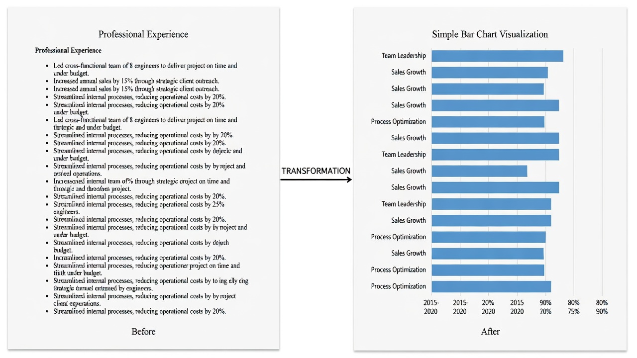
In tech, a traditional bullet list for project metrics transforms into a compact pie chart showing skill distribution, increasing recruiter time spent by 40 percent. In marketing, icons replace lengthy text for campaign results, improving scannability during quick reviews. Corporate finance roles benefit from subtle line graphs tracking revenue growth over quarters. Consider a healthcare resume: before, a dense paragraph lists patient outcomes; after, a horizontal bar chart compares improvement percentages across categories. For education professionals, an infographic timeline of certifications replaces a plain list, highlighting progression without overwhelming the page. These transformations maintain ATS compatibility by embedding alt descriptions and keeping primary text intact.
Visual vs Traditional Formats: Pros and Cons
Visual Format Pros
- Higher engagement from recruiters who spend more time on visually appealing documents
- Quick data comprehension that highlights achievements like sales growth or efficiency gains
- Modern appeal for creative roles in design, advertising, or digital media
- Ability to showcase analytical skills through charts without extra paragraphs
Visual Format Cons
- Risk of ATS rejection if overused or if graphics are not text-backed
- Potential file size issues that delay uploads on job portals
- Less suitable for highly formal industries like law or government
- Requires extra time for testing and refinement before submission
Traditional Format Pros
- Maximum ATS compatibility across all major platforms
- Easy keyword optimization for specific job descriptions
- Universal acceptance regardless of industry or company size
- Simpler to update and tailor for multiple applications
Traditional Format Cons
- Can appear outdated in competitive 2026 job markets
- Lower visual impact that fails to capture attention quickly
- Harder to highlight complex metrics without dense text blocks
- May blend in with hundreds of similar submissions
Practical Checklist for Implementation
- Limit visuals to 10 percent of the page to avoid clutter
- Use high-contrast colors for readability in both digital and print versions
- Include alt text descriptions where possible for accessibility
- Align all elements to a grid for professional polish
- Review for mobile responsiveness since many recruiters view on phones
- Test ATS parsing at least twice with different simulators
- Incorporate industry-specific keywords near visuals
- Seek feedback from peers in target roles before finalizing
Common Pitfalls That Lead to Rejection
Avoid embedding charts as images without text backups, using non-standard fonts that ATS cannot read, or cramming too many elements onto one page. These errors cause parsing failures or make resumes look unprofessional. Another frequent mistake is ignoring file format requirements; some portals reject high-resolution graphics. Over-reliance on color can also backfire if the document is printed in grayscale. Always create a plain-text version as backup and compare submission rates between visual and traditional versions in your job search tracking spreadsheet.
FAQs on Compatibility and Best Practices
Can I use charts in my resume without ATS issues?
Yes, when charts are simple and exported properly as PDFs with embedded text layers for machine readability.
Are visuals appropriate for corporate roles?
Minimal icons and single data points work well; save elaborate infographics for creative positions where design matters more.
What tools ensure the best compatibility?
Canva and Flourish offer ATS-friendly export settings when templates are chosen carefully and tested thoroughly.
How many visuals are too many?
One or two maximum per page maintains balance and prevents the document from becoming overwhelming or unparsable.
Should I customize visuals for each application?
Yes, tailoring charts to match job requirements increases relevance and shows attention to detail during the application process.
Conclusion: Applying These Techniques Today
Strategic data visuals elevate resumes when balanced with ATS needs. Start with one simple chart, test thoroughly, and refine based on industry feedback. This approach delivers immediate results for both creative and corporate job searches in 2026. By following the guidelines, examples, and checklists provided, you can create resumes that engage recruiters while navigating automated systems successfully.


No comments yet. Be the first!